In the previous post I had discussed how to compute raster statistics by vector polygon in QGIS. This post will discuss more or less the same thing, but using Google Earth Engine (GEE) platform. We will compute some statistics figures like mean, median, mode, minimum and maximum. And at the end all the statistics figures will be plotted into a one graph as seen in the following figure 1.

|
|
Figure 1. Statistics Figures Plot |
In this tutorial I applied the same scenario that used NDVI and the local area boundary of Vancouver City. Therefore we will start this tutorial with NDVI calculation.
To do NDVI calculation can be done with the following code.
1 2 3 4 5 6 7 8 9 10 11 12 13 14 15 16 17 18 19 20 |
//LOCAL AREA BOUNDARY DATA var local_area = ee.FeatureCollection("projects/geodose/assets/local-area-boundary"); //SENTINEL-2 DATASET var dataset = ee.ImageCollection('COPERNICUS/S2_HARMONIZED') .filterDate('2021-06-01', '2021-12-30') // Pre-filter to get less cloudy granules. .filter(ee.Filter.lt('CLOUDY_PIXEL_PERCENTAGE',20)) .select('B.*'); //GET MEDIAN IMAGE AND CLIP TO AREA OF INTEREST var image=dataset.median().clip(local_area); //CALCULATE NDVI var ndvi = image.normalizedDifference(['B8', 'B4']); //ADD TO MAP Map.addLayer(ndvi,{min:-1, max:1,palette:['white','red']},'ndvi') Map.addLayer(local_area,{},'Local Area') Map.centerObject(local_area); |
In the code above, firstly we define a variable for local area boundary data which is called local_area. The local_area variable is a feature collection from the shared assets. So you can use it immediately. Then in the dataset variable, we define the image collection from Sentinel-2 satellite imagery within a date range of June - December 2021, filter the cloud coverage below 20% and select all Bands.
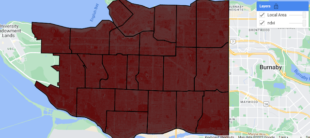
Image collection comprises all filtered images. In line 12 we only take a single image from the image collection based on median value and clip it with local area boundary. The calculation of NDVI is taking place in line 15 using the normalizedDifference method. The rest of the code is adding NDVI and the local area boundary into the map. After running the code you should get the result as shown in the figure 2.

|
|
Figure 2. Data Added to GEE Map |
Next we will do computation for some statistics parameters as mentioned
above. For this we have to aggregate the data using Reducer. As shown in the following code, there are some reducers method are applied such as: mean, min, max, mode and median. All reducers are combined into a variable reducers.
1 2 3 4 5 6 7 8 9 10 11 12 13 14 | // STATISTICS PARAMETERS COMPUTATION var reducers = ee.Reducer.mean().combine({ reducer2: ee.Reducer.min(), sharedInputs: true }).combine({ reducer2: ee.Reducer.median(), sharedInputs: true }).combine({ reducer2: ee.Reducer.mode(), sharedInputs: true }).combine({ reducer2: ee.Reducer.max(), sharedInputs: true }); |
Before plotting the graph, maybe you want to check the statistics result. For that we can use the image.reduceRegions() to get image statistics for multiple regions at once. In the code below the reduceRegions was applied on the NDVI image and print the result to the console as shown in figure 3.
1 2 3 4 5 6 7 8 9 | // APPLY REDUCERS TO IMAGE var stats = ndvi.reduceRegions({ collection:local_area, reducer: reducers, scale:500 }); // PRINT THE RESULT TO THE CONSOLE print(stats); |
 |
| Figure 3. Printed Statistics Result in the Console |
Lastly we create a graph to plot all statistics variables using ui.Chart.image.byRegion() as in the code below. The code mainly consists of two parts: The first one is the part for image and regions properties where we define image's name, vector regions, reducers, scale and the property for x axis. The second part we specify the chart's type and its options like the chart's title including x and y axis title, line and point size and define color for the graph. Lastly to show the graph the print command is used.
After running the code you should get a graph as in figure 1.
1 2 3 4 5 6 7 8 9 10 11 12 13 14 15 16 17 18 19 20 21 22 23 24 25 26 27 | //PLOTTING CHART var chart = ui.Chart.image .byRegion({ image: ndvi, regions: local_area, reducer: reducers, scale: 500, xProperty: 'name' }) .setChartType('LineChart') .setOptions({ title: 'NDVI Statistics by Area', hAxis: { title: 'Area', titleTextStyle: {italic: false, bold: true}, //ticks: 'mapid' }, vAxis: { title: 'NDVI', titleTextStyle: {italic: false, bold: true} }, lineSize: 3, pointSize: 8, colors: ['f0af07','fc8d59','fee08b','91cf60','1a9850'] }); print(chart); |
That's all the tutorial on how to compute and plot image statistics by region in Google Earth Engine. We had discussed how to create a NDVI image from Sentinel-2 satellite imagery, compute some statistics parameters using image reducer and plot all statistics variables into a graph. Hope this tutorial is useful. Thanks for reading!
To see the code in action. Check out the following video!
